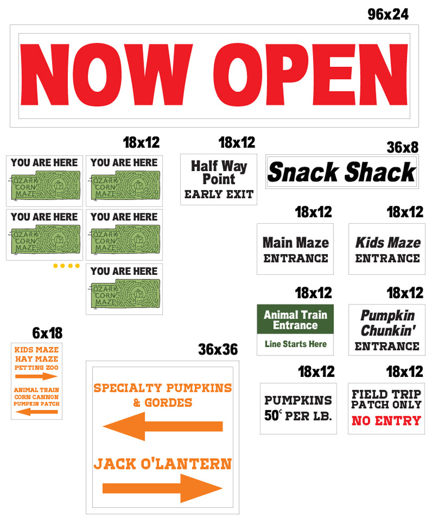
Corn-Maze-All-Signs
Here are the rest of the signs for the Ozark Corn Maze. I reused the font from last year in conjunction with the font from the new sign so existing signage would fit with it. Last year is was predominately black lettering on white. I added color to some of the signs to add some fun to this family friendly corn maze attraction. They seemed to like what I designed and they were great to work with!


