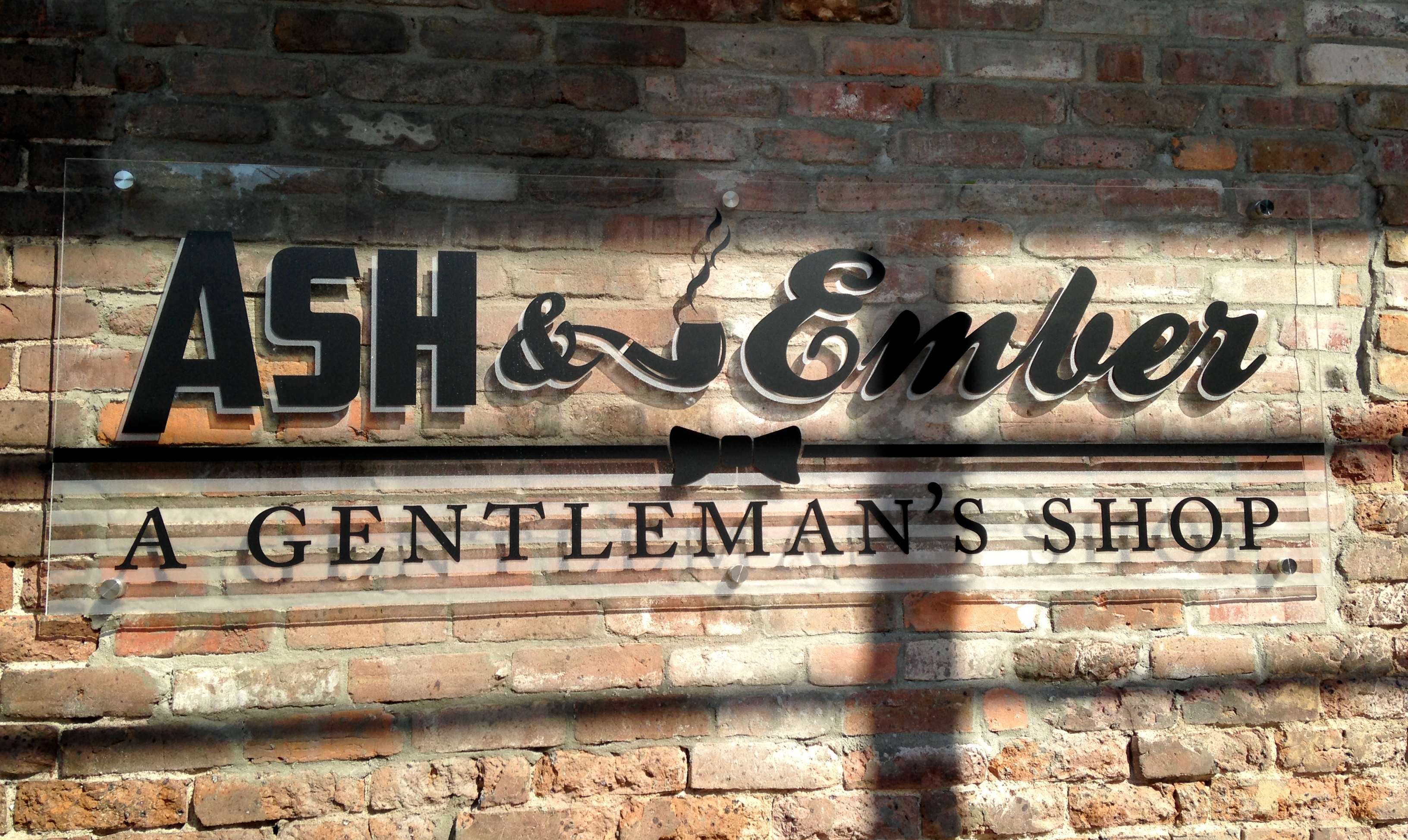
« Ash&Ember: A Gentleman’s Shop
ash and ember main sign
The sign I designed for Ash&Ember. This sign was team worked as far as it’s final execution. It was to be lit which was pricey, I had the idea to make it in-house with plexiglass with frosted elements on standoffs, the production manager suggested lighting it from behind and using translucent vinyl lettering in black. In the end we came up with a sign that looks almost painted on in the day and saved Ash & Ember some scratch!


